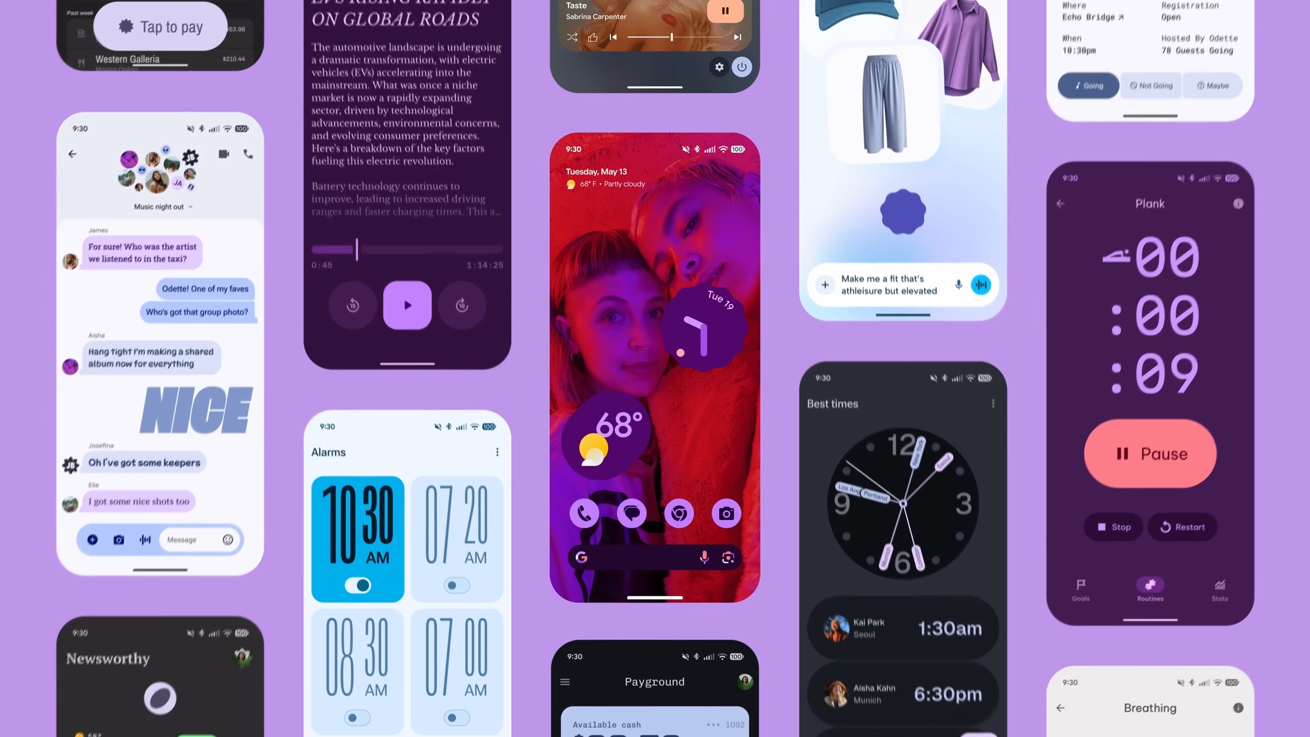
The Material 3 Expressive design language for the Google Gmail app represents a major change from the previous versions. One main feature is the use of more vivid colors, along with new shapes and smoother animations, which are the main elements of the fresh design philosophy. This is a general update that is related to all Google apps for Android, where the company is trying to have the same look for all its apps.
A Bold New Look for Your Inbox
The Material 3 Expressive design of the Gmail app, which is currently being implemented, is a more sophisticated one as compared to the “Material You” theming only, which was the basis of Android 12. The main difference is that “Material You” was just about the colors, while Expressive brings out more interaction and feeling. One of the major differences is the new “card-style” layout.
Instead of a simple list, the emails and the UI elements are presented as separate containers with rounded corners. The concept of depth and visual separation is now at the forefront, thus making the process of scanning your inbox much easier.
Enhanced Usability and Aesthetics
The change to the new design is not only a visual change but also a functional one. Google has done the research and found that users are more satisfied with the expressive designs, and as a result, the interfaces become easier to use. A good example is the new design, which features more prominent and even highlighted text styles to make the user aware that there are some things, like unread messages or headings, that need immediate attention.
The update additionally features:
- Vibrant Colors: The wider, more detailed color palette that dynamically updates the main elements of the app, such as the “Compose” button and other action buttons, has been used in the new version of the app; hence, the buttons are attracting more attention now visually.
- Fluid Motion: Small but engaging animations have now been integrated into different user scenarios. A swipe to delete an email, for example, is accompanied by a “gooey pill-shaped” animation, which gives an impression of being more interactive and quicker.
- Improved Hierarchy: The combination of the card-based layout and the revised typography have synergized to co-create a better-defined visual hierarchy, thereby directing the user’s glance and making it easier to spot what they want.
The Broader Google Ecosystem
This change in Gmail comes from a bigger, coordinated plan. Google is introducing Material 3 Expressive to the design of many other core apps, such as Google Messages, Keep, and Google Wallet. Having uniform designs for different apps means a more unified and smoother user flow throughout the Android ecosystem is possible.
By standardizing the visual and functional aspects of its apps, Google is striving to establish a familiar and user-friendly environment for users, no matter which Google service they are using.
The implementation of this new look has been a slow, server-side process, which means some users may have been able to access it earlier than others. This staggered distribution allows Google to gather reactions and adjust the design before rolling it out completely.
Conclusion
The implementation of Google’s Material 3 Expressive design for the Gmail app signals a major change in the way the app’s user interface is designed, changing from mere color themes to a more lively, intuitive, and emotionally engaging experience. The features of this new design, such as the card-based layout, smooth animations, and cleaner typography, are part of a plan to standardize the design of all Google apps.
The decision to redesign is essentially a statement of intent from Google to produce user interfaces that are pleasurable to use and personality-affirming, thereby increasing both their utility and aesthetic appeal.

